Comparing the Amount of Water Needed to Produce Different Foods
How 15,415 Got in my Head
This topic did not just come to me as a random shower thought, as fitting as that would have been. I was doing what plenty of people do: wasting time on the internet. I came across one infographic that showed the water needed to produce 1kg (2.2lbs) of food. At the top, it showed that 1kg of tomatoes required 214 liters (56 gallons) with a tiny little puddle next to a cartoon tomato. At the very bottom, there was a cow next to a huge pond that showed 1kg of beef required 15,415 liters (4,072 gallons) of water. This didn’t sit well with me.
To me, it just didn’t make sense to compare the same weight of tomatoes and beef. While, 1kg of beefsteak tomatoes is less than 200 calories, the same weight of ribeye is right around 2,900 calories. Its just not an honest comparison. I then wondered what the source of that number was. It was probably done unscientifically or it was fully funded by someone with an agenda. So I decided to look into it deeper. I eventually did find the source, but while doing my research I learned a lot more about the idea of water scarcity.
Why should we care about water?
Cape Town Water Crisis
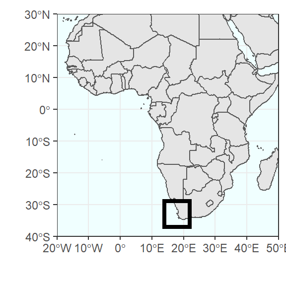
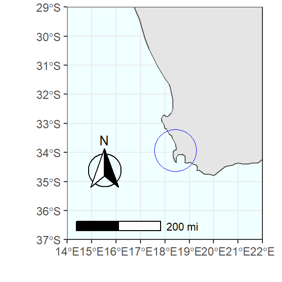
I remember my first reaction to hearing about water scarcity was doubting it was a real issue. Then I learned that, in January of 2018 it was announced that Cape Town, South Africa was less than 90 days away from running out of water, which they called “Day Zero” (Time, 2018). See the map below for the location of Cape Town. At that point they would have to shut off water and people would have to go to one of 200 water collection points in the city. They would then have wait in line to receive their daily allotment of 6.6 gallons. For reference, shower heads in the US are usually capped at 2.5 gallons a minute (Portland Water Bureau). Using this 2.5 gallon/minute flow rate, the 6.6 gallons of water would allow you to have a 2 minute and 38 second shower.
Fortunately, through several measures, Capetonians were able to redirect water and reduce their use enough to push back Day Zero indefinitely. One measure taken was every person was capped at 23 gallons per day, which is about 9min and 12 seconds of shower time per person (but note that they have to use this allotment for all of their water needs per day, not just showers). Businesses also helped with the effort; restaurants put up “if it’s yellow let it mellow” signs (meaning, don’t flush your toilet until it has solid waste), and offices had “dirty shirt” challenges to see who could wear the same shirt the longest without washing (Alexander, 2019). However, one single change was able to reduce water usage by 15%. Farmers agreed to half the water they were using from 30% of all water down to 15% (Mail and Guardian, 2018).
Water shortages and legally mandated restrictions are not isolated incidents. In 2018, California imposed permanent water restrictions that go into effect statewide in 2022 (LA Times, 2018). These restrictions will limit indoor water use to 55 gallons per person per day, which comes out to a 22 minute shower using our numbers from above (but again, will apply to all water usage per day).
Fresh vs. Salt Water
The biggest irony about the Cape Town water crisis is that the city is surrounded by water, as you may have noticed in the graph above. However, it is surrounded by salty, ocean water, which is totally unusable for most of our needs. If we were cats this would be much less of an issue, because cats’ kidneys are efficient enough that they can drink salt water for short periods of time and hydrate from it (Base Paws).
According to the USGS, fresh water only accounts for 2.5% of all water on the earth. Of the fresh water we do have, about 68% is frozen in glaciers and ice caps, 30.1% is underground, and only 1.2% can be found on the earth’s surface. The easily usable water falls into the following categories:
- Lakes
- Soil moisture
- Swamps, marshes
- Rivers
- Atmosphere
- Living things (Humans included!)
The graph below shows the breakdown of fresh and salty water, with the fresh water further broken down into frozen, underground, and surface (which may be difficult to see because it is so small).
The following graph shows just the fresh water so that the surface water (lakes and rivers) is easier to see. The missing portion is the water in soil moisture, the atmosphere, and living things.
We get most of our fresh water from rivers and lakes, which only account for 22,339 cubic miles of the 332.5 million cubic miles of water on the planet (.006%). To put this into perspective, let’s go back to the shower example. My friend Chris likes to take 45 minute showers, if all 7.7 billion people in the world took 45 minute showers everyday for a year we would use about 1.29% of all fresh water. The average person lives 72 years, so if we all showered like Chris during our collective lifetimes we would use 92.7% of all the fresh water in our rivers and lakes. I don’t want to be alarmist, so I do want to make clear that most of the water we use does get treated and is reintroduced into our rivers and lakes.
Water use in Agriculture
Therefore, we should all blame Chris for our water problems right? Well, not quite. As depicted in the graph below, only 12% of water worldwide is used for domestic/house hold purposes(FAO). Industrial uses account for 19% of all water used, and agriculture uses the majority, at 69%, of all water used. Chris, sorry for the accusations, you are off the hook this time!
Across the world, it was estimated by FA0 (2016) that agriculture used about 664 cubic miles of water. By 2050, agriculture is expected to use 2,042 cubic miles of water a year due to the increase in population and changes in food habits (UNESCO, 2012). That would account for 9.14% of all the fresh water in our rivers and lakes every year.
Before I go much further, I just want to make it clear that I support agriculture and farmers. Without them we would not have food, and that is just as important as water. We could blame farmers, but they are just reacting to the demands of consumers. As long as people want to pay for certain foods, there will be someone willing to produce it for money. I’m also not saying you as a consumer should never eat certain foods. This post is purely meant to be informative.
Water use for Different Foods
I need to give a huge thanks to M.M Mekonnen and A.Y. Hoekstra from the University of Twente in the Netherlands. All the water data for the next section comes directly from their research. They published two papers that are seminal to the field in the early 2010s (Mekonnen & Hoekstra, 2011; Mekonnen & Hoekstra, 2012). The papers have been cited by other researchers 1,391 and 799 times respectively. The 2011 paper focuses on the “water footprint” of farmed crops and the 2012 paper focuses on the water footprint of farmed animals.
Mekonnen & Hoekstra (2011,2012) refer to this concept of water footprint as coming from 3 different sources: green, blue, and grey. Let me explain each briefly:
- Green - water from rain
- Blue - water from rivers, lakes, or groundwater
- Grey - fresh water needed to dilute pollutants enough to meet good water quality standards
They calculated each of these separately and then added them together to get the water footprint. They did this for 106 animal products and 355 plant products, in every country. From this they calculated worldwide averages of the water needed to grow each of these products.
Revisiting 15,415
I came across these researchers in my hunt for 15,415. If you take a second to google “15,415 liters,” you will get tens of thousands of results and all of them will eventually point back to the Mekonnen & Hoekstra paper. If you google “water needed to produce beef”, the majority will also point back to this article and give the 15,415 number. I read the article and pretty quickly found out they do include food comparisons by nutritional content.
The graphs below show how much of a difference that calories add. The graph on the top left shows the average amount of liters needed to produce beef and vegetables, illustrating that beef uses 47.8x more water. The graph on the top right shows the liters per calorie, and this shows beef using 7.6x more water. So, while beef does use more water, anyone that cites “15,415 liters” is exaggerating the issue quite a bit. The bottom two charts further break down the relationship between water and calories of protein and fat. Interestingly, when it comes to calories of fat, beef actually needs 1 liter less water than vegetables. If you want to see the exact numbers, just hover over the bars in the chart (this applies to most of the charts in this presentation).
For the remainder of the analyses included in this post, I will be using the raw water data as Mekonnen & Hoekstra did not provide calorie data for all the products (only a handful). However, please keep in mind that calories would change these numbers quite a bit. In the future, I hope to do a follow up post that takes the calorie data into account.
Water use for Plants
Smallest Water Footprint
First, let’s take a look at the plant products that use the least amount of water. A quick note: if you click on a category in the legend you can remove the data that it corresponds with from the chart (including the text total). If you double click on a category in the legend you can isolate that single data point. That way you can see the grey, green, or blue water footprint for each product. Hovering will give you the specific numbers underlying that data point.
Also I’m going to cite the green, blue, and grey water sources. The important thing to remember is that:
- Green water (rainwater) is the only one that is 100% sustainable,
- Blue water (rivers, lakes, and groundwater) is a mix and can be sustainable or unsustainable, and
- Grey water (fresh water needed to dilute pollutants) is the least sustainable.
As you can see, sugar beets require the least amount of water out of any plant product (or animal product for that matter). I think we should take this to mean that Dwight Schrute was actually a secret environmentalist.
Largest Water Footprint
On the other side of the spectrum are the plant products that require the most water. This is one graph where being able to isolate a data point (grey water in this case) by double clicking the legend is extremely useful.
Vanilla beans require the most water of any plant. This is likely due to their light weight and their extremely long grow time (multiple years). The other water intensive plants are either spices or fats.
The next few categories I’m going to visualize are fruits, veggies, drinks, and carbohydrates. For each category I’m going to pick out the most popular or interesting products. I decided “popularity” by googling “popular fruits and veggies” and selecting the ones that showed up the most. For drinks and carbs I picked the most interesting to me. If you want to see a break down for every product in the database skip down to the last section. There are 355 products in the plant data, so I can’t visualize everything and expect you to read this whole post. First, let me visualize some of the most popular fruits.
Fruits
All of these fruits get the majority of their water from green sources, which is the most sustainable source. I found it surprising that fresh apples were the “worst” of this group, using the most total, blue, and grey water. Fresh strawberries use the least amount of any kind of water, as well as water overall. Strawberries are my favorite fruit, so this gives me an excuse to eat more of them. Next, let’s take a look at the veggies.
Vegetables
All the vegetables in this group use less water than the fruit group and overall this trend holds with veggies using less water than fruit. However, both groups do get most of their water from green sources. Looking at the other water sources, tomatoes use the most blue water, while cauliflower use the most grey water. If you have read this far, I want to say thank you, and feel free to grab a drink for this next section…
Drinks
If you grabbed alcohol then you made an environmentally friendly decision. However, this isn’t quite a fair comparison as 1kg of coffee beans/ tea leaves makes far more than 1kg of coffee and tea. For reference, 1kg of beer is 33oz which is slightly less than 3 cans, or about 1.3 bottles of wine. It is still surprising that tea and coffee require so much water to produce.
I recommend hovering over this graph and clicking the option that says “compare data on hover” (second from the right). That way you can see the beer/wine breakdown with having to zoom in. A quick note, I have kept the original names from the dataset the same on my graphs, with the exception of the wine label, which I shortened from “Grape wines nes,incl fort&grape must,unfermntd by add alc,in ctnr > 2l”. The final plant category I’m going to look at is carb or grains.
Carbohydrates
Carbs are really light in weight, so it is not surprising that they require quite a bit of water to produce 1kg. I was, however, surprised that there were such large differences within this group. It is interesting to note that although cereals require the most total water, they actually use the least water if you remove green water, so they are arguably the most sustainable. The difference is not small either. Cereals use around 100 liters, while the rest use between 250 and 700 liters of grey and blue water.
Water use for Animals
As with the section above, I’m using full product names. this makes it easier to search in the bottom section, and it keeps me close to the source data. Here are some words they use that are not as common:
- Bovine = Cow
- Swine = Pig
- Offal = Internal organs (don’t look it up, its a catch all category)
Similar to the plant products, I’m going to start the animal section with the five products in the data that use the least amount of water.
Smallest Water Footprint
Milk products dominate the bottom of the animal products, along with baby chickens and pig offal. The bottom five plant products are all less than the lowest animal product. One of the main reasons for this is many animals are fed plant products, which gets counted into their water footprint. About 6% of the plant products (22 products) had smaller water footprints than baby chickens, the animal product with the smallest water footprint. What surprised me is most water sources on this list are attributed to green sources.Next let’s look at the 6 animal products with the largest water footprint in the dataset.
Largest Water Footprint
I had to pick the top 6 because of a tie (between pure-bred horses and other horses). Also, the top category is clearly an outlier which I thought about removing, but I wanted to stay true to the source data.
I think my desire to remove an outlier makes more sense now, and I’m not just talking about the visual aspect. Once again, I highly recommend hovering over the graph and clicking the “Compare data on hover” button to make the data more visible. This list is dominated by mainly horse products and 1 non-food cow product. In the United States, horses are not typically consumed and were actually illegal from 2006-2011, so from an environmental perspective most people aren’t consuming the most water intensive meats.
The animal products don’t fall into as clean categories as the plants, so I had to get a little creative picking them:
- Fresh Meat (whole animal)
- Beef (fresh/frozen, bone-in/boneless)
- Common Animal Products
- Leather
Once again, the full dataset is at the bottom of this post if you want to see all 106 animal products. Let’s start with the different whole, animals.
Fresh Meat (whole animal)
I picked “whole animals” because every animal had this category so it seemed like the best way to compare them.
I found it really interesting that generally speaking, the leaner the meat the smaller the water footprint. It would be interesting to see if that holds up when nutrition and macro nutrients are factored in. I was also once again surprised that the vast majority of the water source is green. If you take out the green (by clicking the legend), the trend totally changes. The bottom three products (turkey, chicken/duck/goose, and pigs) by total use the most grey and blue water sources. This shows that there is far more nuance in how environmentally friendly certain products are, and this is just taking water into account. The following graph digs a little deeper into beef.
Beef (fresh/frozen, bone-in/boneless)
This graph seems a little boring, but it actually shows a few interesting points. The first point is getting cuts versus the whole cow requires no more additional water if the meat is fresh. The second point is fresh meats require 30% less water than frozen meats (at least with beef). The third point brings this whole post full circle; everyone that reported beef requires 15,415 liters to produce did not mention anywhere that it was FROZEN beef only. If they were going to compare it to FRESH tomatoes, for example, they should have used the water footprint of FRESH beef as a comparison.
This would further make my point that beef does not use 47.8x more water than tomatoes, and probably less than the 7.6x I cited earlier with calories. This also shows the importance of finding the original source of your data! As I said earlier, you can find the 15,415 number everywhere and many of those times it doesn’t even point back to the original source. It cites someone else who used the number. By doing this, you remove all context such as knowing that it only applies to frozen beef, or that the original authors thought nutrition was an important factor to consider.
Moving on, let’s take a look at some other common animal products, including one of my favorites: cheese!
Common Animal Products
A quick note, I did lump the following cheese categories into “Processed Cheese” because they use the same amount of water:
- Cheese processed, not grated or powdered
- Cheese, grated or powdered, of all kinds
- Cheese, blue-veined
Most of the products are milk or made from milk. Before writing this post, I didn’t realize whole milk requires slightly more water than skim milk. It also made sense that fresh cheese needs less water than processed because of water needed for processing. I didn’t expect eggs to be so high on this list, but they required much more water than milk. Finally, butter requires the most water of any milk product. I added the final product because “cured swine bellies” is really a roundabout way of saying bacon. To be honest, I mostly just added included it because it’s also one of my favorite foods. Notably, bacon does require more water than regular pork to produce.
The final animal section I want to explore is a non-food animal product, leather.
Leather
I’m not a huge leather person, but I thought this was worth sharing. I don’t imagine there is much overlap between people who wear leather and people who care about water footprints, but if you are one of those people you are in luck today! I would recommend getting sheep, lamb, or goat leather over cow leather as there is a huge difference in water usage, as you can see from the graph below.
All Numbers
Thank you for reading down this far! I admit that this post ended up being longer than I had expected, but there were a lot of data to explore on this topic, and these were only some of the products included in the research by Mekonnen & Hoekstra. As such (and as promised above), here are the explorable, full datasets. The data is sortable by column (just click on the column name), or you can just type words into the search bar to find specific products.
Plant Data
Animal Data
Sancho Sequeira
Senior Research Analyst
I am interested in data wrangling, statistics, automating workflows, and data visualization using R.